
Our Blog
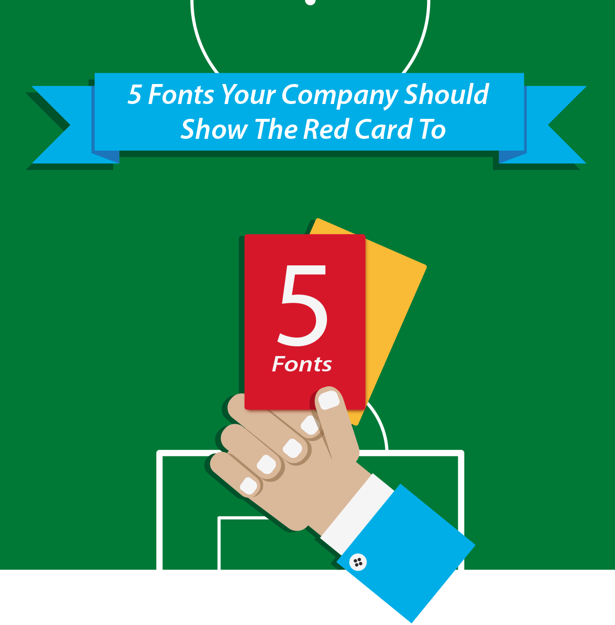
5 Fonts Your Company Should Show The Red Card To
Written by Lewis Llewellyn on June 11, 2014
Much like a manager picking his starting 11, choosing the right typeface for your company can be an arduous task. It’s important that your company’s image and ethos are reflected in the typeface that you choose, and getting it wrong can mean a blurred understanding of your brand and the services that you provide.
Sometimes though the project is a simple courtesy letter, or a notice to be placed above a photocopier to gently remind staff that making 100 copies of their body parts is not allowed under company policy. What typeface do you use for those?
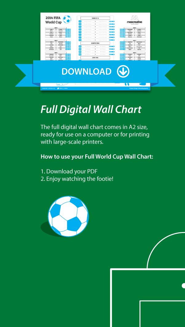
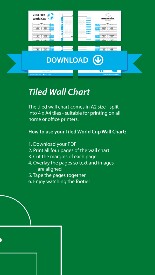
We’ve compiled a list of 5 fonts that are often used in offices around the world – all included in popular workplace operating systems – and what we feel are suitable alternatives for each. Don’t forget to read through to the end to grab your downloadable World Cup fixtures chart!
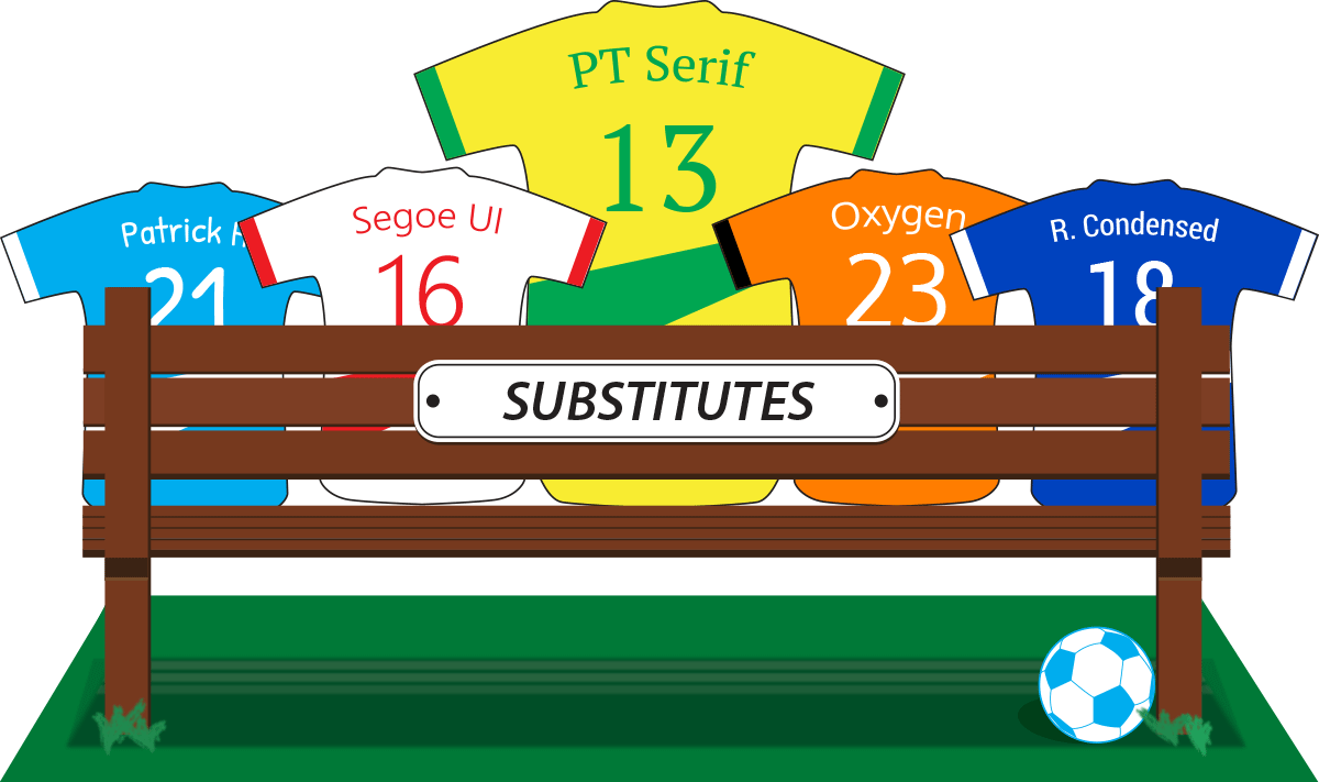
1

Microsoft took Times New Roman off the pitch as the default font for Word in 2007, promoting Calibri to team captain. While there’s nothing wrong with using Times New Roman – it’s a solid typeface – to some it represents a bygone era of word processing.

At first glance, PT Serif looks much the same as Times New Roman, but with its angled serifs and pointy terminals, it provides a fresh alternative to its semi-retired team mate.
2

Arial also saw itself eager to return to the pitch when Microsoft picked Calibri during the transfer season. Almost identical in weight and size to Linotype’s cult-classic Helvetica, Arial is a clean sans-serif typeface that is easy to read both on screen and in print – even if it does look a little stale.

The Segoe family is currently the face of Microsoft, with its use in both the Microsoft logo since late 2012 and as the system font in their Windows Phone and Windows 7/8 operating systems. Segoe UI is a proud, professional font that is suitable for a wide range of applications – a powerful asset to any team.
3

There are few fonts – few of anything, even – that invite more hatred than Comic Sans. Developed by Vincent Connare in 1994 during his time with Microsoft, the typeface was designed to supplement one of the company’s user interface overlays, Microsoft Bob, to make it friendlier for children (in this instance it would replace Times New Roman); Comic Sans never made it into the release of the short-lived software, and has since suffered abuse at the hands of clueless office managers and logo designers across the world.

Handwriting fonts aren’t hard to find, but we especially like Patrick Hand – a nicely-weighted typeface that is reminiscent of popular web comics. Every player has to start somewhere, and Patrick Hand (not to be confused with Maradona’s “Hand of God”) has taken his team from Conference to League Two .
4

Verdana has been in action for 18 years, starting life in the hands of British type designer Matthew Carter. This typeface is especially no stranger to Swedish furniture king IKEA, who use this sans-serif across all of their brochures, advertising and in-store information materials.

Oxygen, with it’s clean style and strong readability, performs at the highest level, scoring points with customers and fans alike. This font would make Zlatan Ibrahimović proud.
5

Impact is a player that does what it says in the programme. It’s been at the forefront of internet memes and office noticeboards for several years now, with the unfortunate effect that everything you write in it looks like you’re trying to pull off a joke.

Google UI designer Christian Robertson designed the typefaces of the Roboto family in 2011, and ever since they have sat as the system fonts for the company’s Android mobile operating system. Roberto Carlos Roboto Condensed is a sure-footed font with the same tall stance as Impact, but without any of the unfortunately childish stigma.

Don’t Miss Out!
Sign up to our mailing list and keep up-to-date with the latest news from MeeCreative