
Tag: BrandingSwansea
Why Print Is Still Important In A Digital World
Written by Thomas Evans on July 5, 2016

In this ever more digital age we live in, with websites and digital media, there is still a need for great design for print. It’s easy to forget how effective ink on paper can be, there are many advantages to this form of marketing. We’ve compiled a short list of why printed literature is still a key piece of your marketing toolkit.
Tangible
Printed literature is an object that can be physically touched and held by your clients – for instance a magazine or a brochure, many of these are found in our homes or offices which are likely to be left around for years, subconsciously leaving a imprint on peoples grey matter. Compared to internet ads which normally disappear within a couple of weeks!
Credible
Print is able to give your clients and consumers that sense of legitimacy. The fact that anyone can just create a website to do anything is overwhelming and the fear of scams and viruses come with this problem, where as print has a more professional image that comes with it.
Branded
Print is also a great way to give your brand a very professional image to make it stronger. However, in order to be successful when doing this you must ensure your communications are consistent throughout. Colours, fonts, images and style of writing should all fit within your brand guidelines and adhere to your company’s ethos.
Targeted
Sending out direct mail is a great way to reach a niche audience that have been harder to reach via online marketing techniques. Not all businesses are completely sold on the internet and feel that some advertisements can be viruses or spam, print allows you to break through the online marketing blur and specifically reach your target audience while still keeping that professional image.
Engaging
79% of people will act on direct mail IMMEDIATELY*. An engaged audience is far more likely to respond to call to actions on advertisements as the majority of readers trust the information that they read in newspapers, magazines and flyers, making print ads a great way for brands to continually build a growing client base.
To Conclude, Print is
- Tangible
- Credible
- Branded
- Targeted
- Engaging
Overall when marketing your business you need to utilise as many different channels as you can to reach your target audience. Most of your marketing activities will be online, but there is also a segment of consumers who really will engage with printed literature. Finding the right balance between all marketing facets is key.
*Royal Mail MarketReach Mail & Digital Part II, Quadrangle, 2014
*‘From letterbox to inbox: Building customer relationships’ dma.org.uk
Need great design for print ?
What We’ve Been Up To
Written by Liam Mee on February 25, 2016
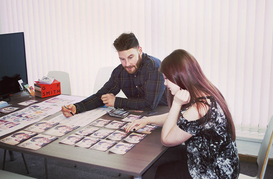
Over the last few months we’ve been a bit quiet with updates – we’ve been successfully completing several client projects and got stuck in straight away with plenty of brand new ones coming into 2016. From brand identity to video production, we thought we’d share an update of what we’ve been doing lately, featuring finished work and also a sneak peak of our current, ongoing projects. We’ve been pretty damn busy!
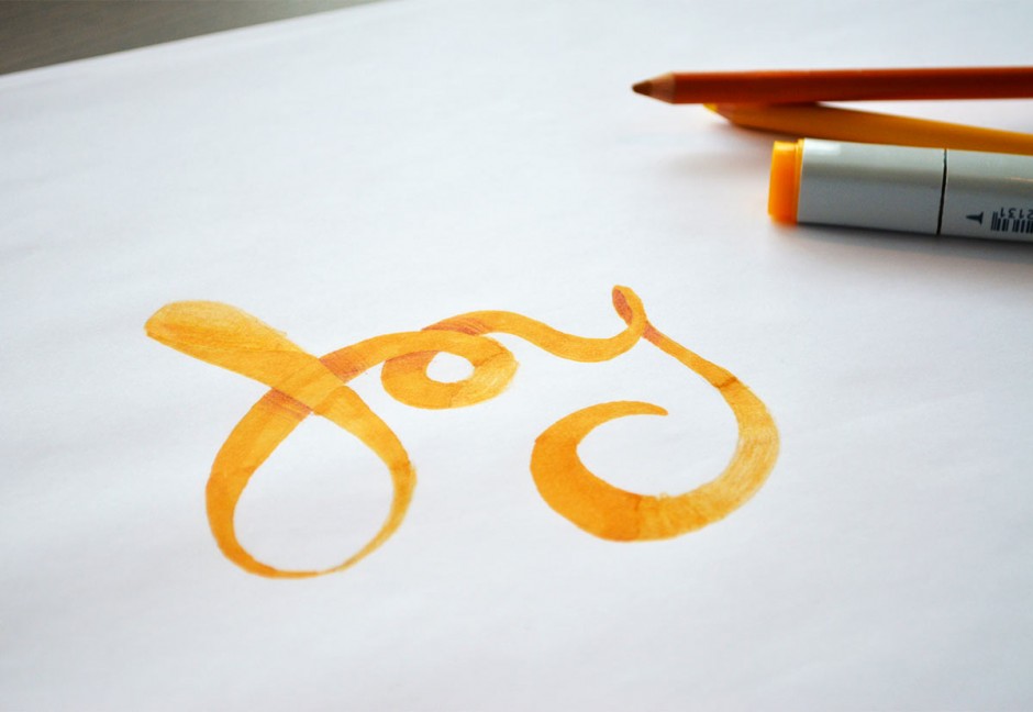
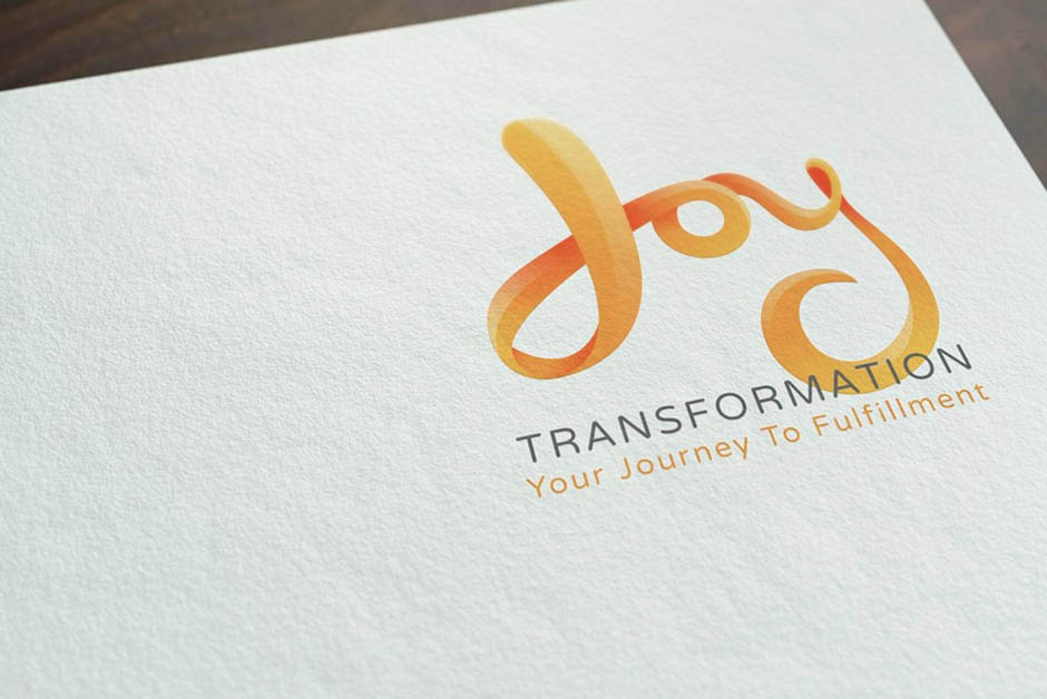
Joy Transformation - Branding

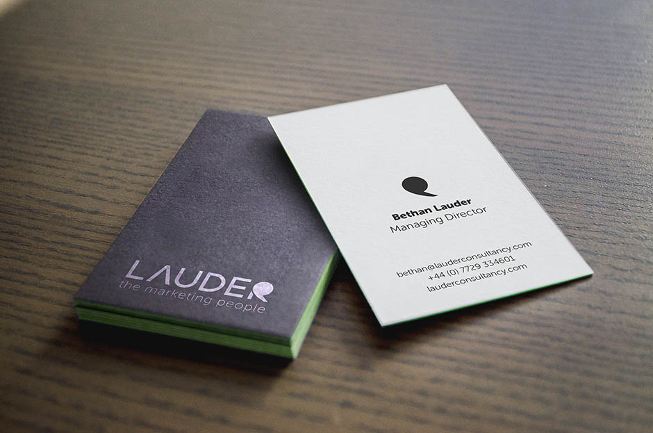
Lauder - Branding + Web Development
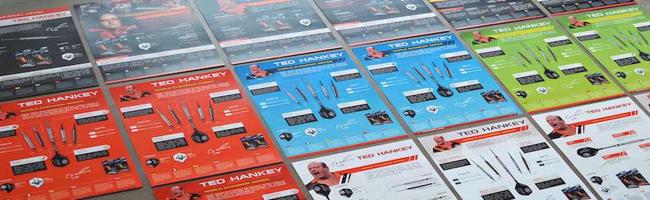
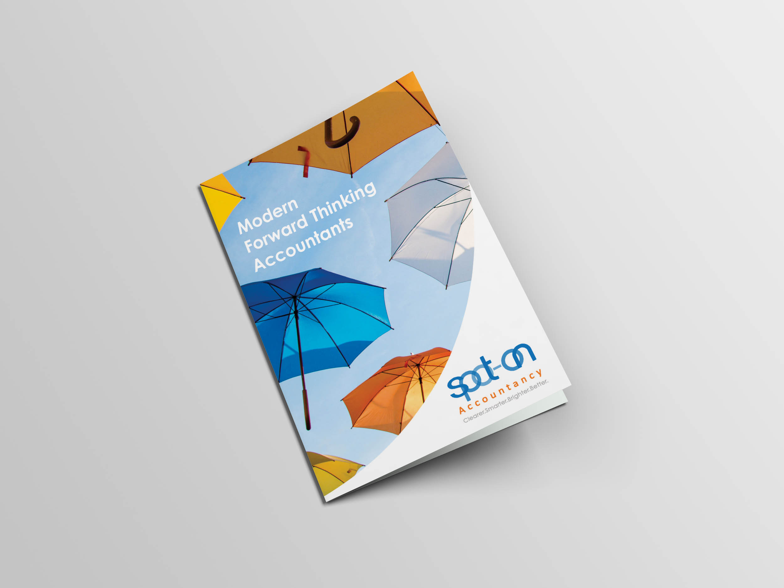
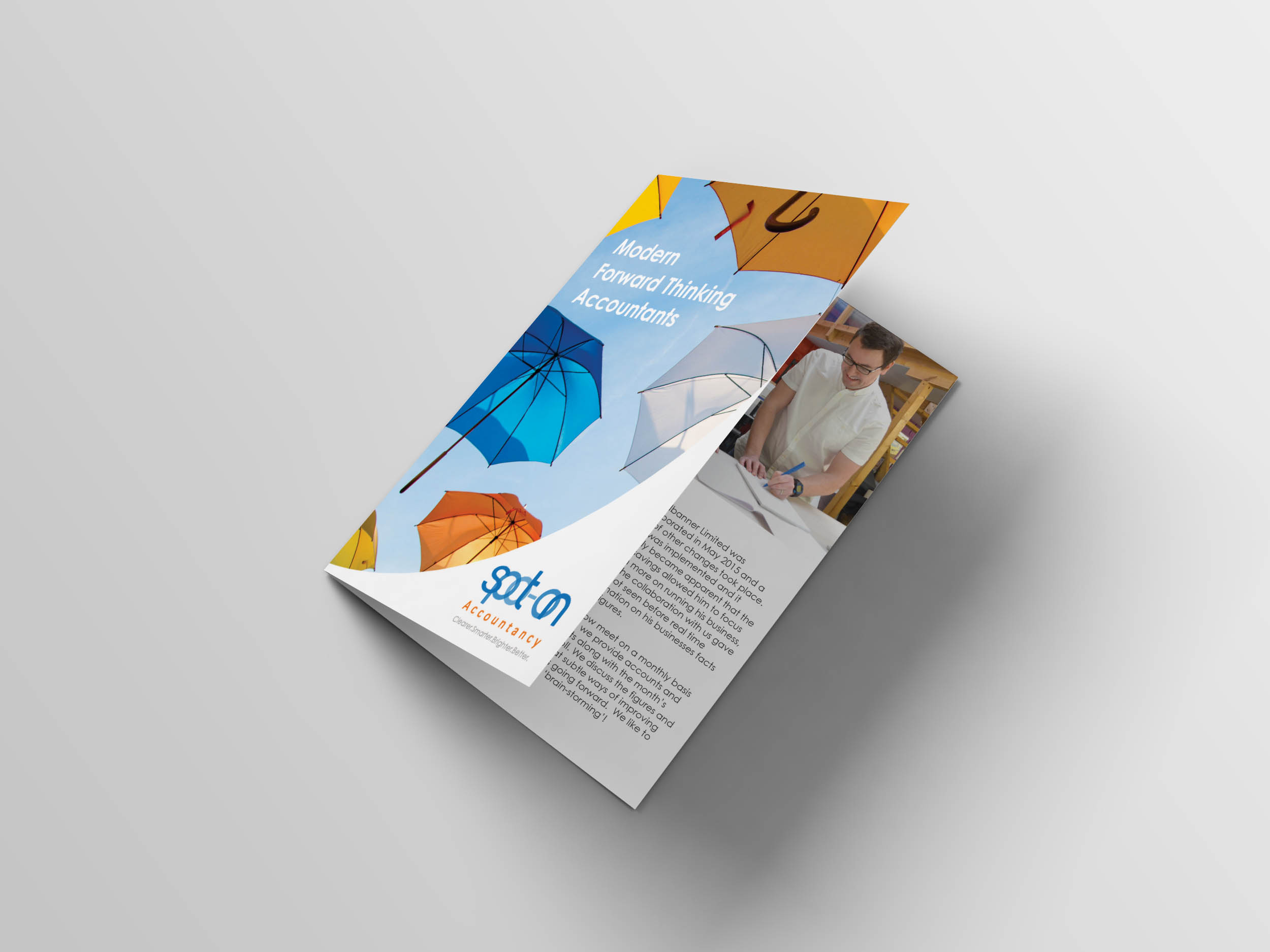
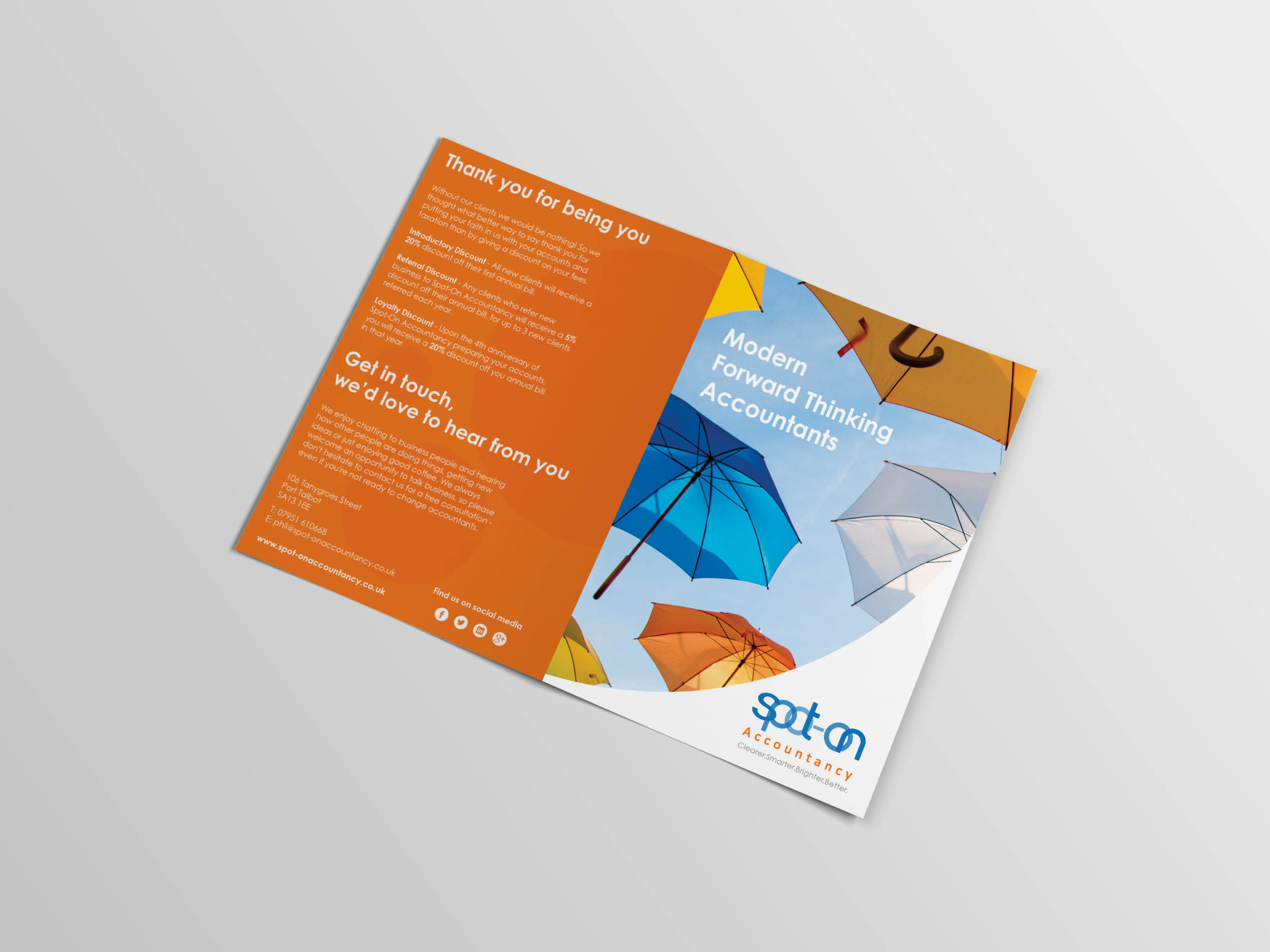
Spot-On Accountancy – Design For Print
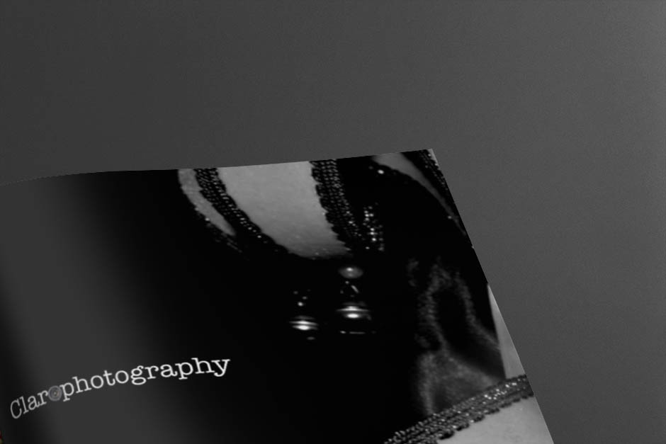
Clarophotography – Design For Print
Afandale - Brand Identity + Web Design


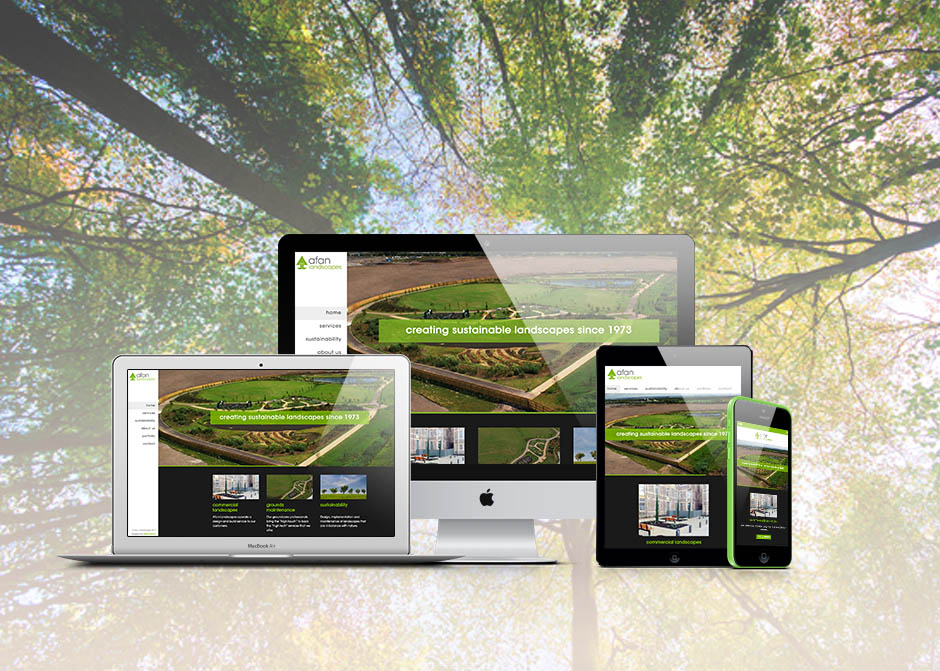
Afan Landscapes - Web Design
Gordon Down Accountants - Design For Print

Internal Marketing
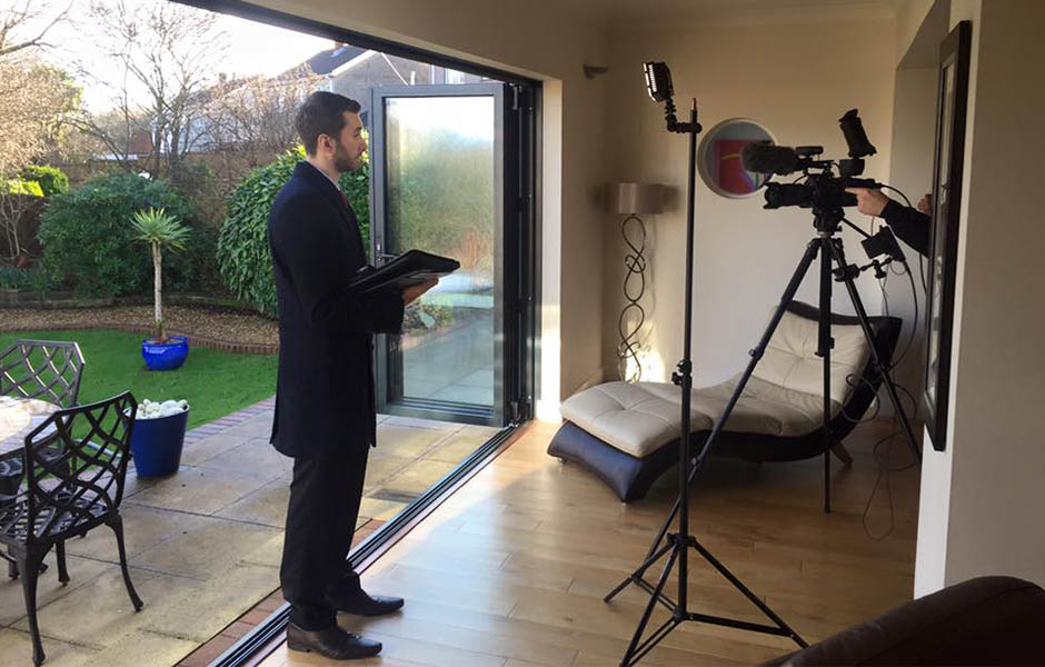
Astley’s Estate Agents - Property Showcase Videos
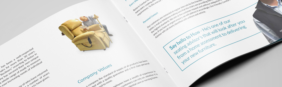
Recliners - Product Information Videos

Type: A Graphic Designer’s Perspective
Written by Jennifer Williams on February 22, 2016
When it comes to branding, the key to success is creating a great visual identity. A few important elements that should always be considered when creating an identity will hopefully leave a lasting impression and portray your brand in the way anticipated.
Choosing the right name for your brand is usually the first factor. Even though it’s not technically part of the design process, you’ll be making sure it looks right as much as it sounds later on.
Creating a successful logo is probably at the top of the tasks, as it potentially becomes the face of the brand. A strong, noteworthy logo will go on to become recognisable without its name, a great example being Starbucks’ most recent logo change.
A colour palette of usually 2 or 3 colours is also important. Colour helps us understand emotion and messages being portrayed through an identity.
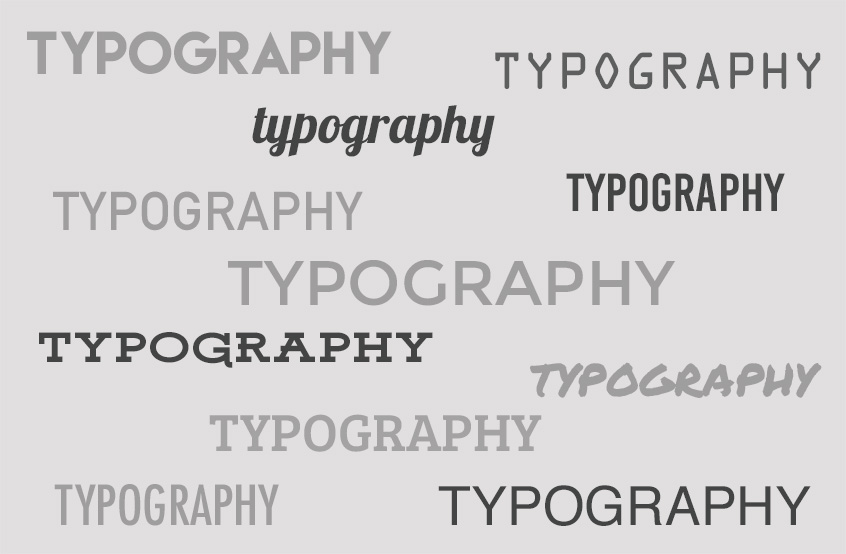
A key element that seems to often get neglected though is typography.
Maybe it’s just because it gets left until last, or choosing type seems simple enough. Deciding on a typeface plays an important role of how your brand will be perceived. Typography creates personality and a certain style, the same way we choose what to wear and how we look. The right choice can help your brand project the right feeling and message to the viewer. When choosing a typeface you should ask yourself ‘does it represent the brand?’ and ‘does it communicate the message?’
Making the right choice
The right choice of type can really enhance a brands’ look, yet the importance of legibility is just as essential. The brand name along with any information needs to be clearly readable whether up close or afar. Choosing a typeface that’s going to compliment the brand is also relevant – you don’t want it to be over the top or to go unnoticed; consistency is always key.
One issue a lot of designers cannot deny is having a personal favourite font. Everyone has that one typeface that they jump to use because it ‘works on almost everything’ – we’re all guilty. Why not spend a bit more time searching for that perfect font, rather than using the same one you’ve seriously over used. You’ll never know until you look. Or even better, get out the mechanical pencil that probably hasn’t seen the light of day since you left University and create your own – now that’s truly unique right?!
Typography in the commercial world
When it comes down to using the same typefaces though, it’s not always negative. Take Helvetica for example – a great typeface, used commercially worldwide especially in industry, although disliked by some due to its popularity. It’s one of those typefaces that does what it needs to, simply states information, legible and straightforward.
Maybe sometimes there isn’t a right or wrong choice as such. That typeface you simply ‘use all the time’ may in fact be perfectly suited for the brand. When typography is done right though, it really pays off.
The good, the bad and the ugly
For example, Wiesinger Music. The choice of type alone creates a modern, professional style for the company, but the designer has incorporated type into the logo too, giving it such a successful brand identity, recognisable with or without the name.

But when the benefits of incorporating good typography into an identity is not quite understood, you come across branding like this; hopefully an explanation isn’t needed here. There’s plenty of this in my hometown of Port Talbot. Who designs this stuff?! Type trends
When brands expand and grow, they sometimes decide to alter or update their image to keep up to date with modern styles and it’s usually their typography that’s put on the chopping block. Recent trends have seen a lot of brands turning to a flatter, clean-cut approach, as it looks ‘better on a screen’ – but how long will this trend last?
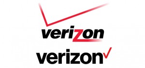
The best example of this would be the new Google design, the typeface itself being the biggest difference as it changed to a modern, sans serif font.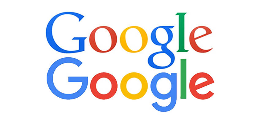 Another big change recently was the design for Verizon seeing it become straight and simpler (another huge brand that now uses Helvetica).
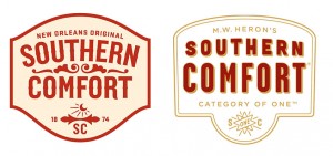
One of my personal favourite brands that had a typography change last year was Southern Comfort. The design was revamped into a modern, sans-serif typeface, with added colour making it much more attractive and desirable on the shelf.
Here’s some of my favourite typography websites for inspiration –
When A Brand Becomes Background Noise
Written by Ashley Vessey on September 10, 2015
Let’s get one thing clear, we’ve all experienced this at some point in our lives. It may have happened in our inboxes, on social media or during an advert on telly.
As brands bombard us with each passing day, they fail to understand why engagement rates are reducing, or why marketing just isn’t working the way it used to.
Falling short in marketing can have a worse effect than to even have no marketing in the first place.
Take this example.
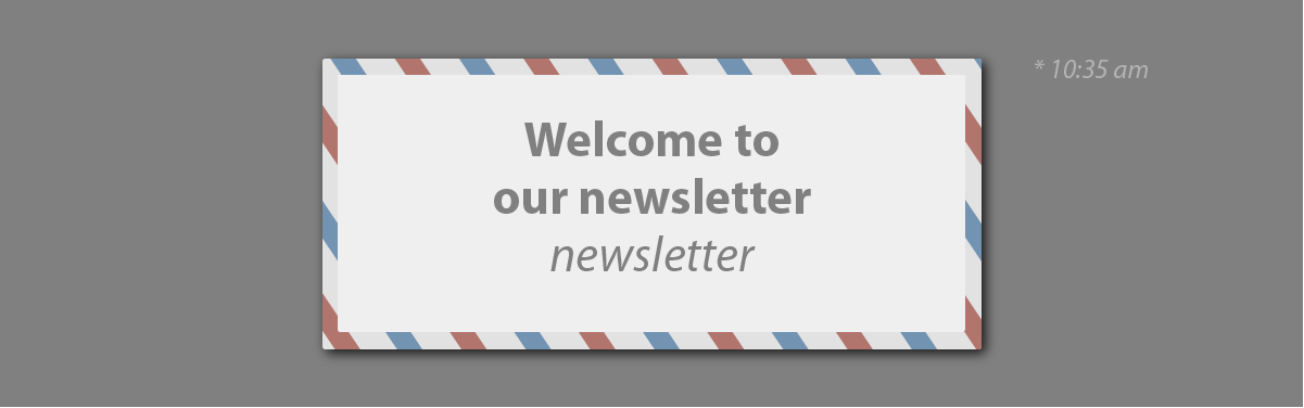
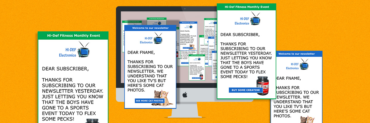
So I sign up to a newsletter. I decide, “Hmm, my living room could do with a better TV. I do like the one we’ve got, but my friend’s TV has all this cool stuff and is bigger.” So I sign up for Hi-Def Electronics’ newsletter. What do I get to my inbox? Well, I get a “Welcome to our newsletter”. Not what I was expecting, but okay.
Tomorrow comes, “Meet Dan, our latest recruit.” Meet Dan? Who’s Dan?
I’m pretty sure that employing new members to Hi-Def is very important to the company, but I’ve only just been introduced to your brand. I don’t care too much about who you bring on. For all I’m concerned, the sales team could be a tower of giraffes.
“Hi-Def Fitness Monthly Event.” “Find us at stand D356”; I was signing up for a TV newsletter, I don’t want to go to an event about fitness. That’s why I’m searching online.
How brands can cause friction
With newsletters, it’s not necessarily the quality of the content produced, but the volume at which it happens. You’ve probably seen this before. I’m currently signed up to a list on Groupon, a global company that offer deals on a wide range of things.
At first, I thought it was a good idea to sign up. Since then I’ve been inundated with deals day after day, some of them good, but a lot of them aren’t even related to what interests me. For that reason, I soon lost interest in the brand and started hitting the delete button as soon as they landed in my inbox. A lot of brands make this mistake by not keeping a consistency on the content they send out. The longer you leave this, the more damage you risk to your business.
We get mentally inundated by brands
These days, we don’t even need to leave the bedroom to understand how many brands are involved in our lives. As human beings, we have a tolerance to quantify how much is too much, before it’s handled subconsciously. We might not be aware of it, but brands like Coca-Cola are so well embedded into our lives, we simply take no notice of them.
With certain brands however, this might not always work the way it should.
As we all know, the brain is a very complex organ. If for some reason it begins to associate a brand with something negative, such as a previous event or an emotion, that’s pretty much game over for them.
When you see the same brand, same person, same logo over and over again, all these associations with the company turns to background noise. You may not notice these changes at all, but your brain soon filters them because it can’t handle the volume at which it’s receiving. So the next time you see that associated brand, your brain switches on ‘filter mode’ and deals with the issue at hand, which may happen on a subconscious level.
Team tip #1: Be unique, be consistent and don’t become repetitive. Consistency in terms of design language is good. But consistency in general may lead to repetitiveness.
Quality is too low or not regular enough for my attention
When quality of the content is lacking or too infrequent to matter, you’ve got yourself a growing problem. This goes back to what I was talking about with Groupon, where one out of a dozen emails were interesting. But the same thing happens if it becomes too infrequently, where having fewer engaging messages will guarantee that people will not want to pay attention and engage with your brand.
You may not know this with Facebook, but if a campaign doesn’t perform up to par with others you’ve produced, the next time you send out a campaign, they’ll set the bar much higher than normal. That way you’ll have to work harder to get the same reach of engagement.
Team tip #2: Make sure to keep an eye on how each campaign is performing; if you notice a spike in engagement, try to figure out how and why this happened.
Team tip #3: Consider producing content that helps and entertains the customer. This might be an obvious one, but we’ve all seen the countless posts about “our latest product range” and “introducing the latest member to the team.” This might be relevant to some, but if the customer signed up just for insight, everything else is just background noise. In short, make sure to only focus on creating content that is insightful, rather than the frequency they get sent out.

Users have limited control over what they receive
Most websites still don’t offer the option to let the user choose the frequency they get emailed, which in my opinion is quite frustrating. If you send out regular emails, why not give control back to the users and let them choose how often they want to receive those emails.
Team tip #4: Even better, give them the choice to choose what type of emails to opt into, be it marketing tips, educational, etc.
In short:
- Keep an eye on how well (or not) your content engages with the audience – if you fall short in an area figure out why that’s happening.
- Bad marketing is just as bad as having no marketing at all.
- Don’t sell your services all the time; make sure to create engaging content that is also educational.
- All companies should use brand guidelines right? The same should apply for your newsletters. Create a brand focused template and stick to it!
- Sometimes campaigns don’t always need to be about the services that your company offer. How about creating a softer campaign that subconsciously draws the reader in while promoting your brand.