
Tag: Logo
Type: A Graphic Designer’s Perspective
Written by Jennifer Williams on February 22, 2016
When it comes to branding, the key to success is creating a great visual identity. A few important elements that should always be considered when creating an identity will hopefully leave a lasting impression and portray your brand in the way anticipated.
Choosing the right name for your brand is usually the first factor. Even though it’s not technically part of the design process, you’ll be making sure it looks right as much as it sounds later on.
Creating a successful logo is probably at the top of the tasks, as it potentially becomes the face of the brand. A strong, noteworthy logo will go on to become recognisable without its name, a great example being Starbucks’ most recent logo change.
A colour palette of usually 2 or 3 colours is also important. Colour helps us understand emotion and messages being portrayed through an identity.
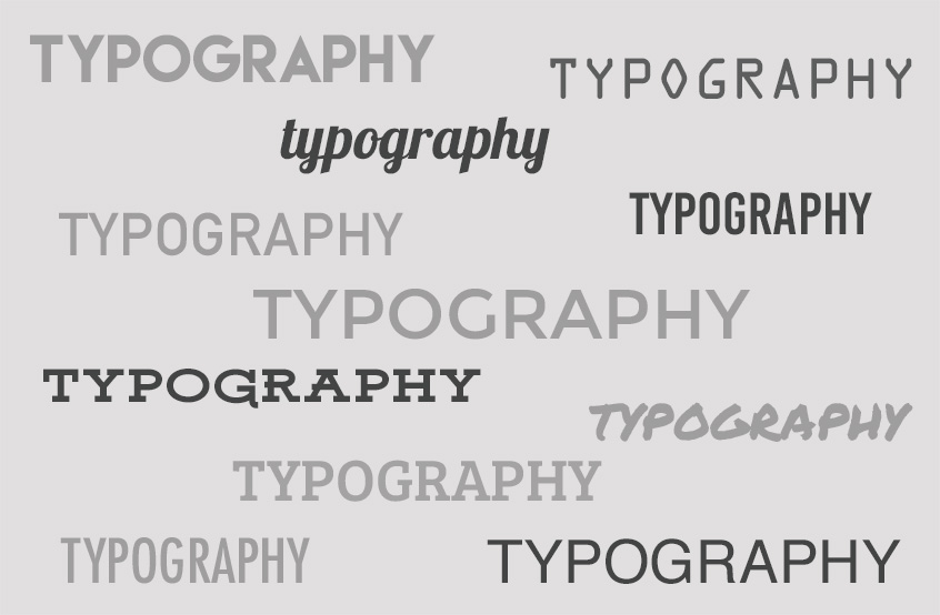
A key element that seems to often get neglected though is typography.
Maybe it’s just because it gets left until last, or choosing type seems simple enough. Deciding on a typeface plays an important role of how your brand will be perceived. Typography creates personality and a certain style, the same way we choose what to wear and how we look. The right choice can help your brand project the right feeling and message to the viewer. When choosing a typeface you should ask yourself ‘does it represent the brand?’ and ‘does it communicate the message?’
Making the right choice
The right choice of type can really enhance a brands’ look, yet the importance of legibility is just as essential. The brand name along with any information needs to be clearly readable whether up close or afar. Choosing a typeface that’s going to compliment the brand is also relevant – you don’t want it to be over the top or to go unnoticed; consistency is always key.
One issue a lot of designers cannot deny is having a personal favourite font. Everyone has that one typeface that they jump to use because it ‘works on almost everything’ – we’re all guilty. Why not spend a bit more time searching for that perfect font, rather than using the same one you’ve seriously over used. You’ll never know until you look. Or even better, get out the mechanical pencil that probably hasn’t seen the light of day since you left University and create your own – now that’s truly unique right?!
Typography in the commercial world
When it comes down to using the same typefaces though, it’s not always negative. Take Helvetica for example – a great typeface, used commercially worldwide especially in industry, although disliked by some due to its popularity. It’s one of those typefaces that does what it needs to, simply states information, legible and straightforward.
Maybe sometimes there isn’t a right or wrong choice as such. That typeface you simply ‘use all the time’ may in fact be perfectly suited for the brand. When typography is done right though, it really pays off.
The good, the bad and the ugly
For example, Wiesinger Music. The choice of type alone creates a modern, professional style for the company, but the designer has incorporated type into the logo too, giving it such a successful brand identity, recognisable with or without the name.

But when the benefits of incorporating good typography into an identity is not quite understood, you come across branding like this; hopefully an explanation isn’t needed here. There’s plenty of this in my hometown of Port Talbot. Who designs this stuff?! Type trends
When brands expand and grow, they sometimes decide to alter or update their image to keep up to date with modern styles and it’s usually their typography that’s put on the chopping block. Recent trends have seen a lot of brands turning to a flatter, clean-cut approach, as it looks ‘better on a screen’ – but how long will this trend last?
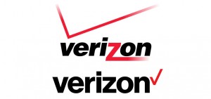
The best example of this would be the new Google design, the typeface itself being the biggest difference as it changed to a modern, sans serif font.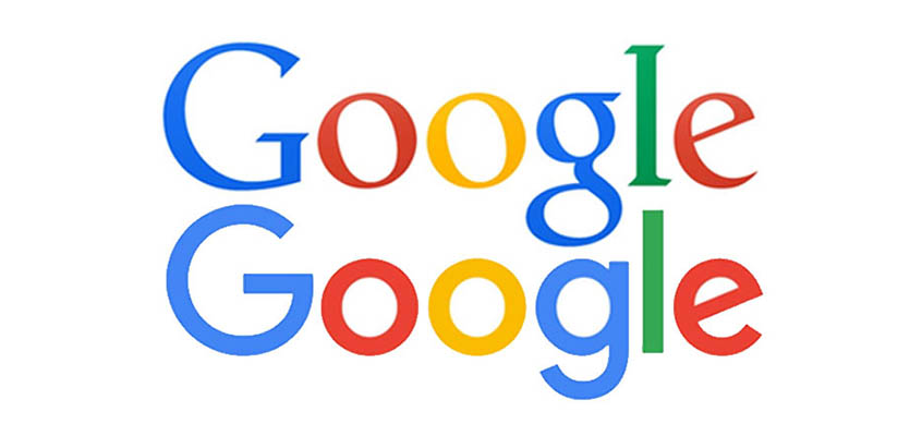 Another big change recently was the design for Verizon seeing it become straight and simpler (another huge brand that now uses Helvetica).
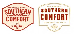
One of my personal favourite brands that had a typography change last year was Southern Comfort. The design was revamped into a modern, sans-serif typeface, with added colour making it much more attractive and desirable on the shelf.
Here’s some of my favourite typography websites for inspiration –
Make 2015 The Most Successful Year Yet!
Written by Ashley Vessey on January 8, 2015
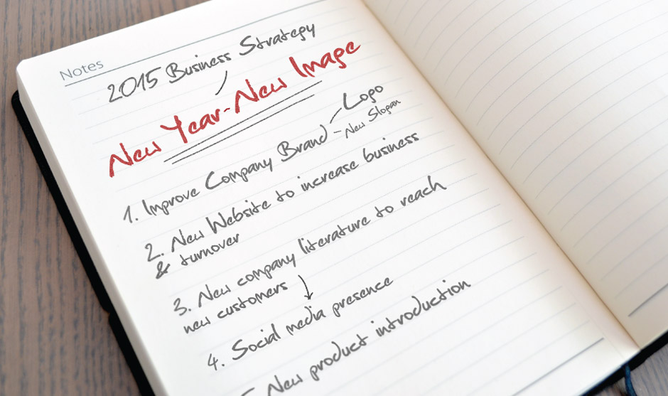
It’s come to that time of year again, where we leave the slumber of our homes to start work anew. So why not make 2015 the most successful year yet by improving your company image?
Work with MeeCreative to implement these core elements to help your business grow and become more profitable:
It’s impossible to understate the importance of an effective logo; it’s the first thing people see when searching for you on social media, receiving your business card, visiting your website, or walking into your office. Your logo is the public face of your company, so it’s important that it looks its best.
A tag line / slogan incorporates your company’s most important benefits in a single phrase or sentence. Successful tag lines are great for marketing and even better for memorability, and including one alongside your company’s logo is a great way to present yourself in the public eye.
Although on paper it is easy to separate a brand identity into its separate parts, it’s difficult to put them together in the first place. Logo, name and all other brand elements must work together to paint a much bigger picture; giving your brand a graphical DNA is essential to helping people recognise and understand your company effortlessly.
Printed media is a big part of showcasing your company both directly and indirectly. You can include as few or as many elements of your company’s brand as you wish depending on the type of item, but keeping business cards, invoices, and even internal memos within your company’s brand guidelines helps to solidify your image in the customers’ minds.
Having a website that effectively portrays the character and values of your company is more important today than it has ever been. With more and more people searching for services on mobile devices, your website is more often than not both the first and the most used point-of-entry into your company’s services. Making sure your website fits your company image makes all the difference in the world.